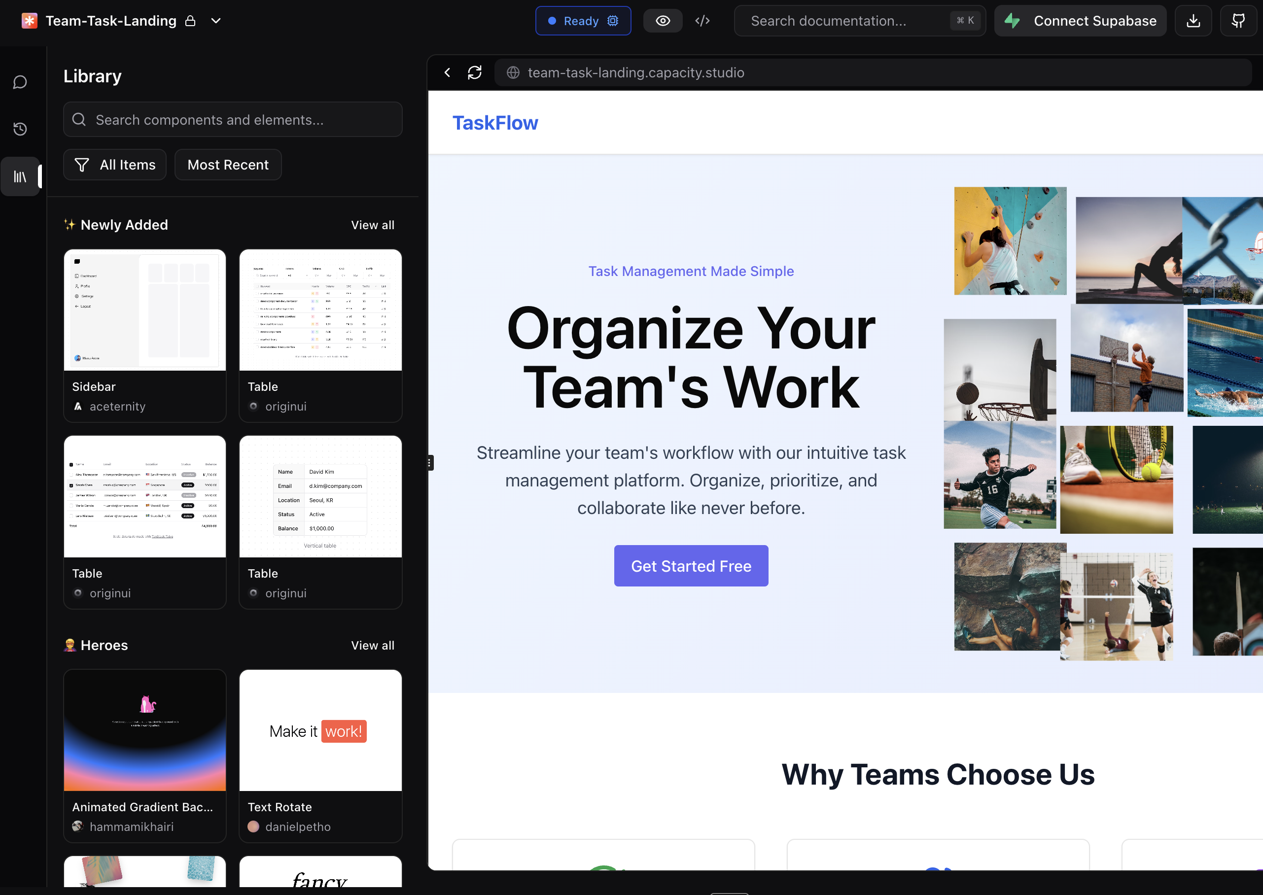
Components Library
Access stunning pre-built UI components and sections to create beautiful, professional-looking apps with AI.
Overview
The Components Library is a curated collection of beautiful, pre-designed UI components and sections that help you build stunning applications. While AI-generated apps can sometimes look basic, the Components Library ensures your projects have professional, modern designs that stand out.

Why Use the Components Library?
Beautiful by Default
AI-generated interfaces often lack the polish and visual appeal of professionally designed applications. The Components Library solves this by providing:
- Stunning pre-built designs created by professional designers
- Modern UI patterns that follow current design trends
- Responsive components that work on all screen sizes
- Consistent styling across your entire application
Save Time
Instead of describing complex designs to the AI or tweaking generated code repeatedly, simply:
- Browse the visual library
- Preview components in real-time
- Add them to your project with one click
- Let AI adapt them to your specific needs
How to Access the Library
- Open your project in Capacity
- Click the Library icon (📚) in the left sidebar
- Browse components visually in the panel that opens
Browsing Components
Component Categories
The library organizes components into logical categories for easy discovery:
- ✨ Newly Added - Fresh components recently added to the library
- 🔥 Popular - Most-used components by the community
- 🦸 Heroes - Eye-catching hero sections for landing pages
- 📢 Announcements - Banner and notification components
- 💬 Testimonials - Social proof and review sections
- 💰 Pricing - Pricing tables and plans displays
- 🔘 Buttons - Interactive button styles and animations
- 📋 Forms - Input forms and data collection interfaces
- 🃏 Cards - Content cards and grid layouts
Search and Filter
Find exactly what you need quickly:
- Search bar - Type keywords to find specific components
- Filter dropdown - Choose between:
- All Items
- Marketing Blocks
- UI Elements
- Sort options - Order by:
- Most Recent
- Most Popular
Visual Preview
Each component shows:
- Preview image - Static screenshot of the component
- Hover video - Animated preview on mouse hover (when available)
- Component name - Descriptive title
- Creator info - Designer attribution
- Like count - Community popularity indicator
Using a Component
Step 1: Preview
- Click on any component to open the full preview
- View the live demo in the preview modal
- Check the component details including creator and likes
Step 2: Add to Your Project
- Click "Use This Component" in the preview modal
- Automatically switches to Chat where the component prompt is ready
- The AI generates the code adapted to your project's framework and style
- Component appears in your app with your content and branding
Step 3: Customize
After adding a component, you can:
- Modify colors and styles to match your brand
- Update content with your own text and images
- Adjust layout to fit your design needs
- Add functionality specific to your application
Best Practices
Choosing Components
Consider your app's purpose
- Landing pages: Focus on heroes, testimonials, and pricing sections
- Web apps: Prioritize forms, cards, and UI elements
- Marketing sites: Use announcement banners and call-to-action buttons
Maintain consistency
- Choose components with similar design styles
- Use components from the same creator for visual cohesion
- Apply your brand colors consistently across all components
Integration Tips
Start with structure
- Add major sections first (hero, main content, footer)
- Fill in with smaller components (buttons, cards, forms)
- Fine-tune the details last
Let AI handle adaptation
- The AI automatically adapts components to your existing code structure
- It maintains your project's framework conventions (React, Vue, etc.)
- Styling is adjusted to match your existing design system
Advanced Features
Expanding Sections
- Click "View all" on any category to see all available components
- Use "Back to sections" to return to the organized view
Keyboard Navigation
- Use arrow keys to navigate the component grid
- Press Enter to open component preview
- Press Escape to close preview modal
External Preview
- Click the external link icon (↗️) to open component in new tab
- Useful for testing responsive behavior
- Share component demos with team members
Tips for Success
For Beautiful Landing Pages
- Start with a striking hero section
- Add social proof with testimonials
- Include clear pricing information
- Use engaging call-to-action buttons
For Professional Web Apps
- Choose consistent form styles
- Use cards for organized content display
- Implement clear navigation patterns
- Add subtle animations for polish
For Maximum Impact
- Mix and match components creatively
- Customize colors to match your brand
- Update content to tell your story
- Test on multiple devices for responsiveness
Troubleshooting
Component Not Displaying Correctly
- Ensure your project has necessary dependencies
- Check for CSS conflicts with existing styles
- Verify responsive breakpoints match your setup
Preview Not Loading
- Check your internet connection
- Try refreshing the library panel
- Clear browser cache if issues persist
Customization Issues
- Use the chat to request specific modifications
- Provide clear descriptions of desired changes
- Reference existing components for style matching
The Components Library transforms AI-generated apps from basic to beautiful. Browse, preview, and add professional designs with just a few clicks, letting you focus on functionality while ensuring your app looks stunning.